Government Compliance Portal
LTN — Nicotine Product Registration Portal
A new Swedish law gave every importer and manufacturer of tobacco-free nicotine products until January 1st to register through a portal that didn't exist yet. We couldn't talk to the people who'd be using it — they were the tobacco industry, and we were the public health agency. The legal text was the brief.
Client
The Public Health Agency of Sweden
Role
UX/UI Designer
Tools
Figma · Confluence · Jira
Domain
Government · Regulatory compliance
Timeline
Dec 2022 – Sep 2024
Team
Solo designer · developers · product lead · QA · ops

Insight
We couldn't do user research with the actual registrants. The legal text was the brief. Designing one system for everyone from a one-person vape shop to Phillip Morris — without research to tell us where the edges were — was the actual challenge.
Action
Interpreted the legal requirements with the agency's lawyers, designed for the widest range of user sophistication, launched a month early so real users could build drafts before the hard deadline, and proposed an agile sign-off that kept things moving even when the approver was unavailable.
Impact
Launched on the legal deadline. Hundreds of products successfully registered. The soft launch a month early validated the design with real users before it mattered. Operations staff who initially resisted the portal became its strongest internal advocates.
The Problem
A new law created a hard deadline. The Public Health Agency had no digital process for product registration. And the people who'd have to run it were worried automation would replace their jobs.
Background
A government agency, a legal deadline, and a registration process that had only ever existed on paper
In 2023, Sweden enacted legislation requiring all tobacco-free nicotine products — pouches, sprays, gums — to be registered with the Public Health Agency before going to market. The law took effect January 1st. Before it, no registration process existed.
The registrants ranged from a one-person vape shop importing a single product to corporations like Phillip Morris with entire product families. One portal, one flow, one registration form — for all of them. Every registration had to include every ingredient, its CAS number, and its ratio in the product. The platform would cross-reference each ingredient against a database of toxic compounds and flag any product with illegal substances or nicotine doses above the legal limit.
We couldn't do user research with the actual registrants. The regulatory relationship between the public health agency and the tobacco industry made that impossible. The legal text and the agency's lawyers were our primary design input.
My Role
The only designer on a small cross-functional team — running research, design, and stakeholder alignment simultaneously
UX/UI Designer at LH+P, embedded with the The Public Health Agency of Sweden team. I was the only designer across the full project — working from legal text rather than user research, designing for an audience I couldn't talk to, and navigating the internal dynamics that sat underneath the surface design problems.
The team was small: me, a few developers, a product lead, QA, and the operations team. Being the only designer meant every decision needed a rationale that worked for multiple audiences — the companies submitting products, the agency staff managing them, and the legal team validating compliance.
Discovery
Legal text as design input — and operations staff as the closest proxy for user insight
With no direct access to the actual registrants, I did two things. First, I read the law — closely, with the agency's lawyers — to understand exactly what a valid registration had to contain and what would disqualify one. Second, I worked with the operations staff who processed submissions manually. They were the closest proxy I had to the registrant experience, and they knew every edge case in the existing paper process.
Every registration had to include every ingredient, its CAS number, and its exact ratio in the product. The platform had to cross-reference each CAS number against a database of restricted substances and automatically flag products with toxic compounds or nicotine above the legal threshold. There was no design discretion here — the law defined what was required.
One flow had to work for a one-person shop importing a single product and for Phillip Morris registering hundreds. Both needed to enter identical information — every ingredient, every CAS number, every ratio — but their capacity for handling a complex form was completely different. Without user research to tell us where the edges were, we had to design for the least capable user while not making it slow for the most capable one.
Every label, form field, and error message had to use officially approved language in both Swedish and English. Design decisions that would be trivial in a consumer context legal review and formal sign-off.
Larger companies already had standardised EU registration documents and wanted to upload them directly. The technical constraints ruled it out. We needed an alternative that reduced the rework of entering similar product data repeatedly — particularly for companies registering product families that differed by one flavour component.
Baseline going in
Every registration arrived via email with no consistent structure. Operations reviewed everything manually. No duplicate detection, no automated validation against the restricted-ingredient database. The design direction was clear: structured data collection, automated flagging, and a sign-off process that didn't collapse under volume or grind to a halt when one person was unavailable.
[ Research synthesis / manual process mapping — add photo or Figma export here ]
The Hard Part
A hard legal deadline, resistant stakeholders, legally controlled content, and a security standard that limited design flexibility
No user research with the actual users
The regulatory relationship between the public health agency and the tobacco industry made it impossible to research the people who'd be registering products. Legal text and operations staff were the inputs. The soft launch — a month before the hard deadline — was the user test.
One interface for an extreme range of users
A one-person vape shop and Phillip Morris had to complete the same registration form. No segmentation, no simplified path for small companies. The form had to be both thorough enough for regulatory compliance and usable enough for someone who'd never registered a product before.
Hard deadline with no flexibility
The law had passed. The portal had to launch before January 1st. No extended research phase, no phased rollout. Every piece of content needed legal sign-off, which had to happen in parallel with design and build — not after.
EU document upload wasn't buildable
Larger companies expected to upload existing EU registration documents directly. The technical constraints ruled it out. The alternative had to reduce the friction of entering similar product data repeatedly without requiring integration with external EU systems.
How I Navigated It
The sign-off bottleneck wasn't a workflow problem — it was a trust problem. The solution was to make automation opt-out, not opt-in.
The central tension: operations needed to feel in control, but the model couldn't scale if every submission needed personal approval. The answer was an asynchronous sign-off protocol — submissions go through automated validation and proceed unless operations flags them. They're still in the loop; they're just not a required gate for every clean submission.
This reframe was key. Instead of "automation will handle it," the message became: "you review what matters, the system handles what's clear." That distinction made the difference between resistance and adoption.
For the legal content problem, I worked in close parallel with the legal team — building design and copy review cycles into the sprint structure rather than treating them as sequential. That kept both moving without either blocking the other.
For the duplicate product issue — companies often register slight variants of the same product — I designed a "duplicate and edit" registration flow, which eliminated the biggest time cost for frequent submitters and significantly reduced the volume of error-prone manual re-entry.
How Might We
Give operations staff oversight without making them a bottleneck — so the system can scale to hundreds of submissions without losing the human judgment that makes it trustworthy?
Design
Step-by-step registration wizard, asynchronous sign-off, duplicate flow, and a dual-view for both companies and agency staff
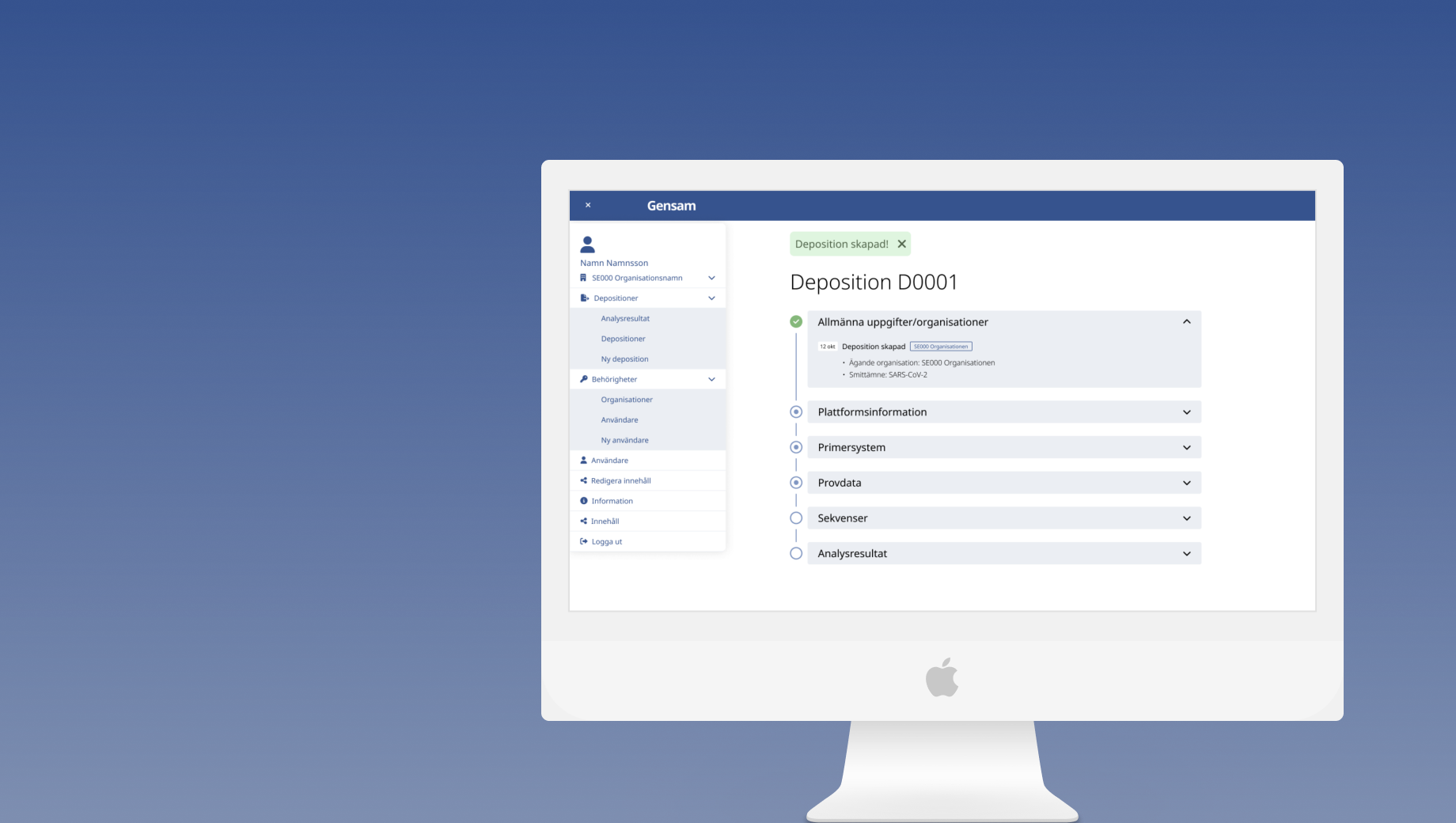
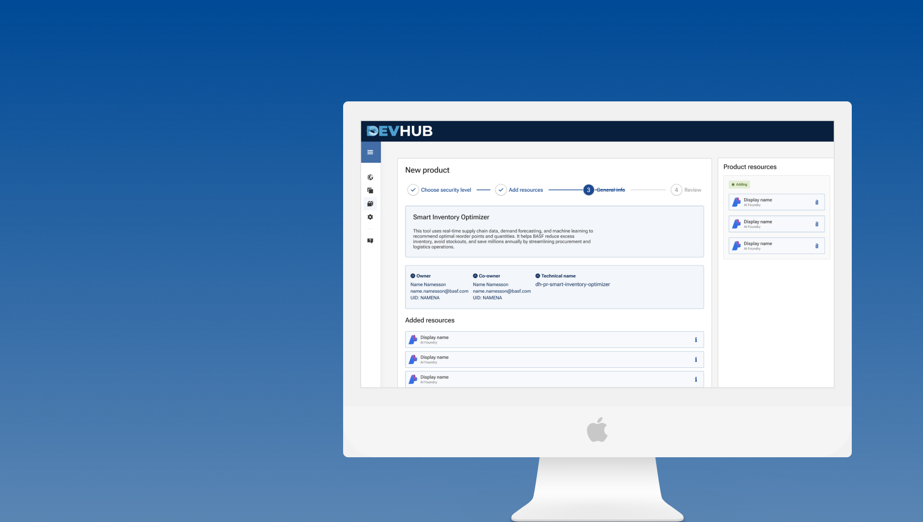
With the asynchronous sign-off model unlocked and the duplicate flow scoped, I built across four areas simultaneously — the company-facing registration flow, the agency-facing review dashboard, the status system visible to both, and the compliance content framework that ran through everything.
Broke the legally complex registration process into clear steps with real-time validation. Every ingredient, CAS number, and ratio collected in a structured form — usable by a first-time registrant and fast enough for a company registering hundreds of products.
Companies can duplicate an existing registration and edit only what's different — useful for a product range that varies by a single flavour component. My idea, in direct response to the EU document upload being cut. Eliminated the biggest source of manual re-entry for large registrants.
Every CAS number checked against a database of restricted substances. Toxic compounds or out-of-range nicotine doses trigger a rejection with the specific ingredient named. Editing is allowed — to correct genuine typos — but any flagged-and-edited registration is added to a monitoring list for physical product checks in stores.
Sign-off was redesigned from waterfall to parallel: steps that don't require explicit approval proceed in the background while the approval is pending. A boss on vacation no longer freezes the entire queue. Final publication still requires sign-off — but the pipeline keeps moving.
Operations are notified of submissions, can flag any at any point, and retain full oversight — but clean submissions don't wait in a queue. This was the reframe that converted internal resistance into adoption: "you review what matters, the system handles what's clear."
[ Registration wizard / agency dashboard screens — add your Figma export here ]
Testing & Iterations
Internal walkthrough sessions with both user groups — company submitters and agency staff — tested separately
Without access to actual registrants, I tested with two groups who were available: the operations team and the development team. Separate sessions, different mental models — "how do I process and approve submissions" versus "does the form collect what the law requires." It wasn't ideal. It was what was possible.
Key finding from operations sessions: the asynchronous sign-off model needed clearer language explaining what "automatic approval" actually meant in practice. Participants wanted to know exactly when they'd be notified and what level of review they were still doing. That informed a dedicated onboarding step for agency staff on first use.
The duplicate registration flow tested well — the operations team noted it would significantly reduce the back-and-forth they currently dealt with for variant products. That validated it as the right call.
Results
Launched on the legal deadline — and hundreds of products registered without the manual-process collapse that would have followed
What I'd do differently
Find a proxy user earlier. We couldn't talk to the tobacco industry, but we could have found someone who imports products in a different regulated category — food supplements, medical devices — and done one structured walkthrough of the registration form. Not perfect, but better than no registrant perspective at all before launch.
Track draft registration activity during the soft launch. We launched a month early specifically to let real users build drafts. We didn't instrument it. Knowing how many companies started drafts, how many abandoned them, and where the drop-off was would have given us actual usage data before the hard deadline. That data would have made the outcome section of this case study significantly stronger.
Design System
Government visual standards applied throughout — with a dual-context system covering both the public-facing portal and the internal agency dashboard
All design built to government visual standards — official colours, typography, and accessibility requirements. The system had to work across two distinct contexts: the public-facing registration portal (company users, potentially any browser, variable technical literacy) and the internal agency dashboard (operations staff, controlled environment, expert users).
Designing for both in the same system required clear shared foundations — component structure, spacing, colour — while allowing the two contexts to diverge where it made sense. The internal dashboard could carry more information density than the public-facing portal.
Help me improve this case study
Takes about 30 seconds — I read every response.
Are you here as a...
Was this case study relevant to what you were looking for?
What's missing or unclear? (optional)